


























Edgefolio · Institutional fintech · AI

Redesigning a fund profile around two users’ jobs to be done

I led the fund profile redesign for a prime brokerage platform. Research found two readers behind one profile, so I gave each their own page

Read
The fund profile page: five headline figures, cumulative returns against the HFRX Macro/CTA Index, About and investment strategy, LP composition, manager commentary and publications, the leadership team and service providers, the introduction request and investor data hub, and the registered office
The Conviction Funnel, the first of the two pages
Owned

Owned the fund profile, onboarding and Investor Hub end to end, reporting to the Chief Product Officer. Built the design system patterns the rebuild needed, which the analytics and Q&A teams adopted

7 of 7allocators reached the data tier unprompted in testing
420+fund managers onboarded at Bank of America in three months
20%projected conversion lift, on a buy cycle of months to years
ProblemThe brief said redesign the fund profile. The research showed two users with opposing jobs to be done sharing one profile, and a layout change could never serve both
ConstraintsThree legacy platforms folding into one as the company pivoted to prime brokerage, no product manager in place, and allocators too senior to test with at will
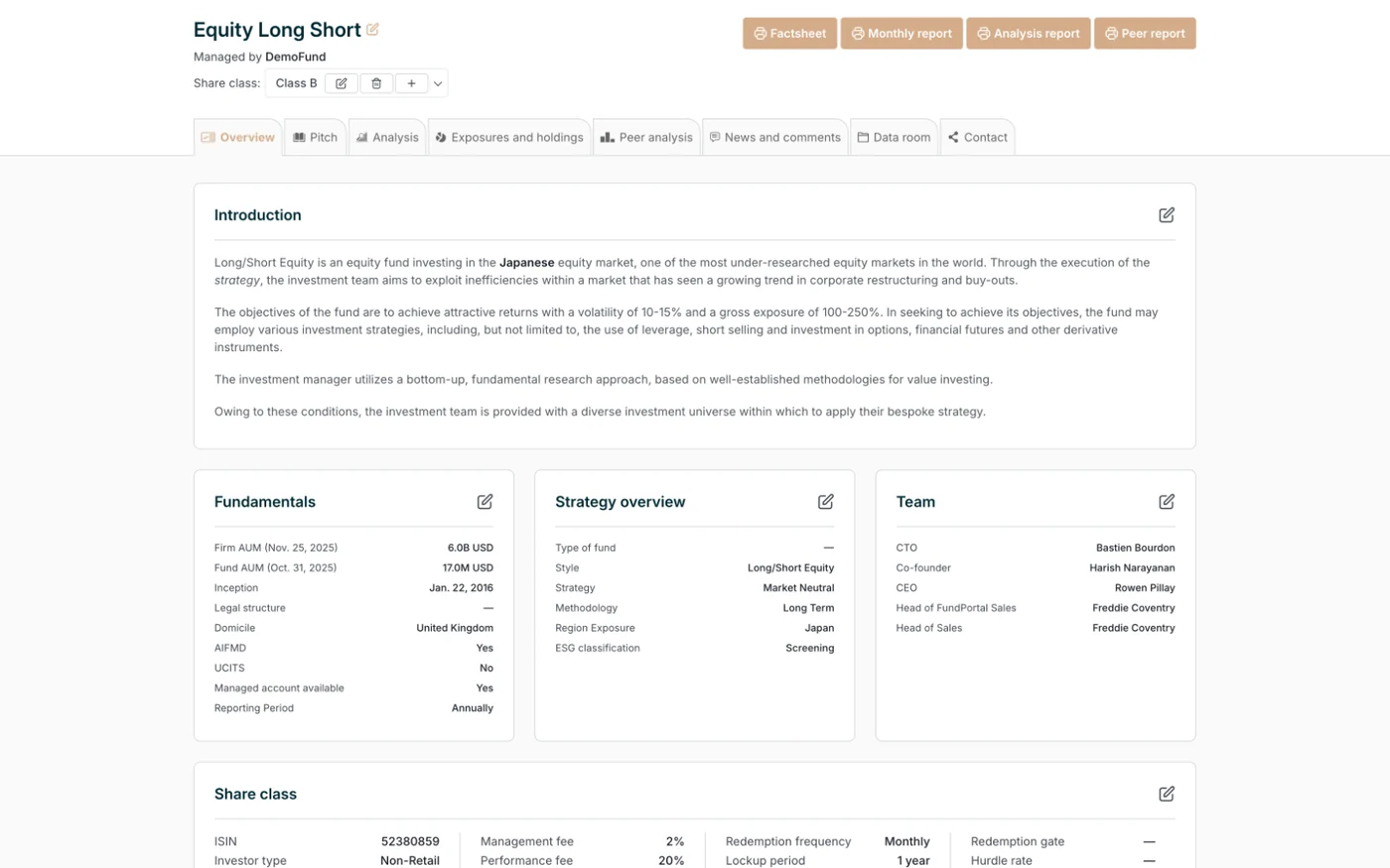
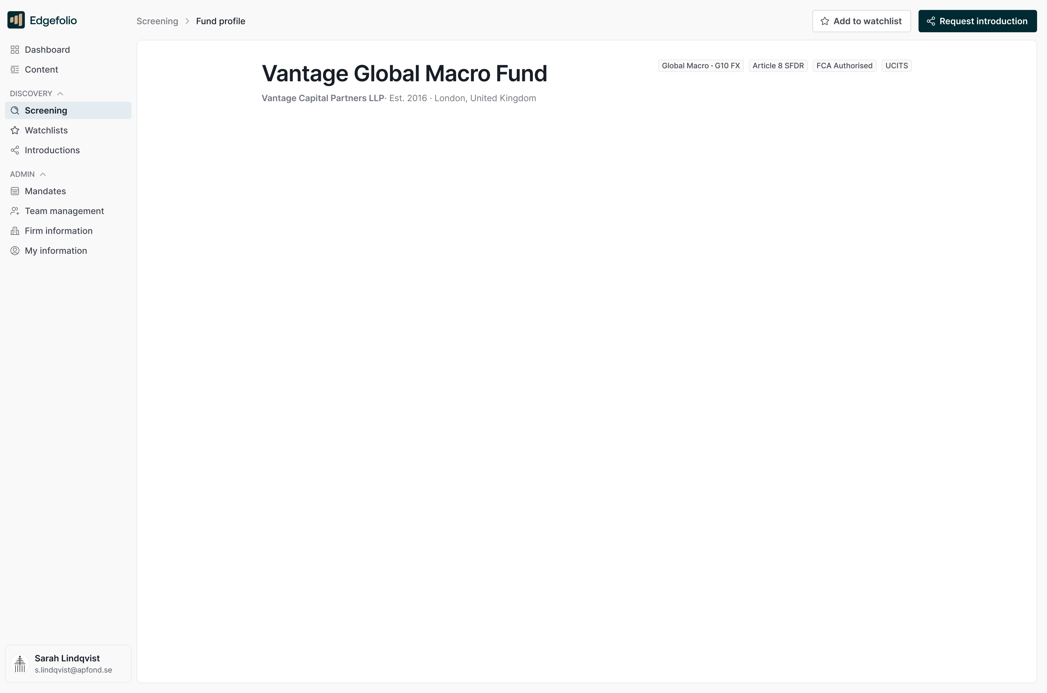
The original fund profile: the fund name, a row of eight tabs, an Introduction of four paragraphs, then cards of small label and value rows for fundamentals, strategy, team and share class The redesigned fund profile: Vantage Global Macro Fund, with the firm, vintage and regulatory tags at the top, then five headline figures, firm and fund assets, annualised net return, Sharpe ratio and fund vintage each with its basis underneath, cumulative returns against the HFRX Macro/CTA Index, the About and investment strategy pair, and LP composition by investor type
The fund profile, drawn twice. Drag to compare
DecisionReframed the work around jobs to be done, tested one full page against two with allocators, and shipped the two: a page per reader on one information architecture, with the design system patterns it needed
The whole Conviction Funnel fund profile: headline figures, cumulative returns, About and investment strategy, LP composition, manager commentary and publications, leadership team and service providers, the introduction request and investor data hub, and the registered office
The fund profile. Scroll inside it, the nav and fund title stay put
ResultIn testing, 7 of 7 allocators reached the data tier on their own, and the projected conversion lift is 20%
The Investor Hub: headline figures, the monthly returns heat map, risk and analytics, strategy allocation, the data room with gated folders, and introduction and materials requests
The Investor Hub, what the portfolio manager takes into committee. Scroll inside it
The manager's Fund dashboard: profile views, data room visitors, allocators in pipeline and introduction requests; the deal pipeline; live allocator activity with what each allocator read and for how long; introduction requests to approve; and profile health
The fund manager's dashboard, the same profile running in reverse

Discovery revealed two users with opposing jobs to be done

The brief was four words, redesign the fund profile. No problem statement, no user definition, no product manager in the loop. I ran the research myself: the information architecture mapped, session recordings of each reader, allocator interviews. The same pain kept returning, too many clicks between a question and its answer.

The original fund profile: the fund name, a row of eight tabs, an Introduction of four paragraphs, then cards of small label and value rows for fundamentals, strategy, team and share class The redesigned fund profile: Vantage Global Macro Fund, with the firm, vintage and regulatory tags at the top, then five headline figures, firm and fund assets, annualised net return, Sharpe ratio and fund vintage each with its basis underneath, cumulative returns against the HFRX Macro/CTA Index, the About and investment strategy pair, and LP composition by investor type
The fund profile, drawn twice. Drag to compare
Overview
The Overview tab: fund introduction, fundamentals, strategy, team and share classes.
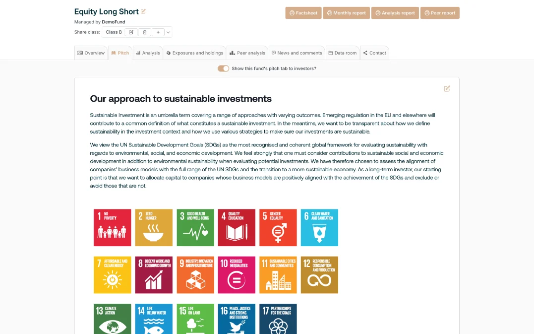
Pitch
The Pitch tab: the manager's sustainable-investment approach.
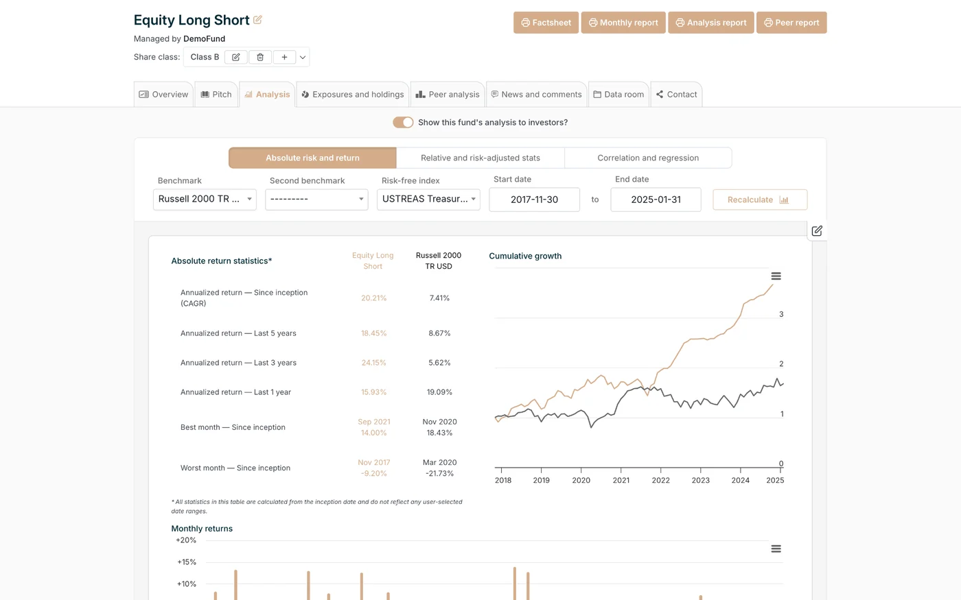
Analysis
The Analysis tab: return statistics, cumulative growth and monthly returns.
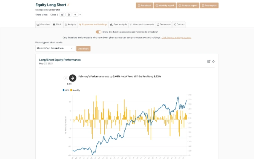
Exposures and holdings
The Exposures and holdings tab: performance and breakdown charts.
Peer analysis
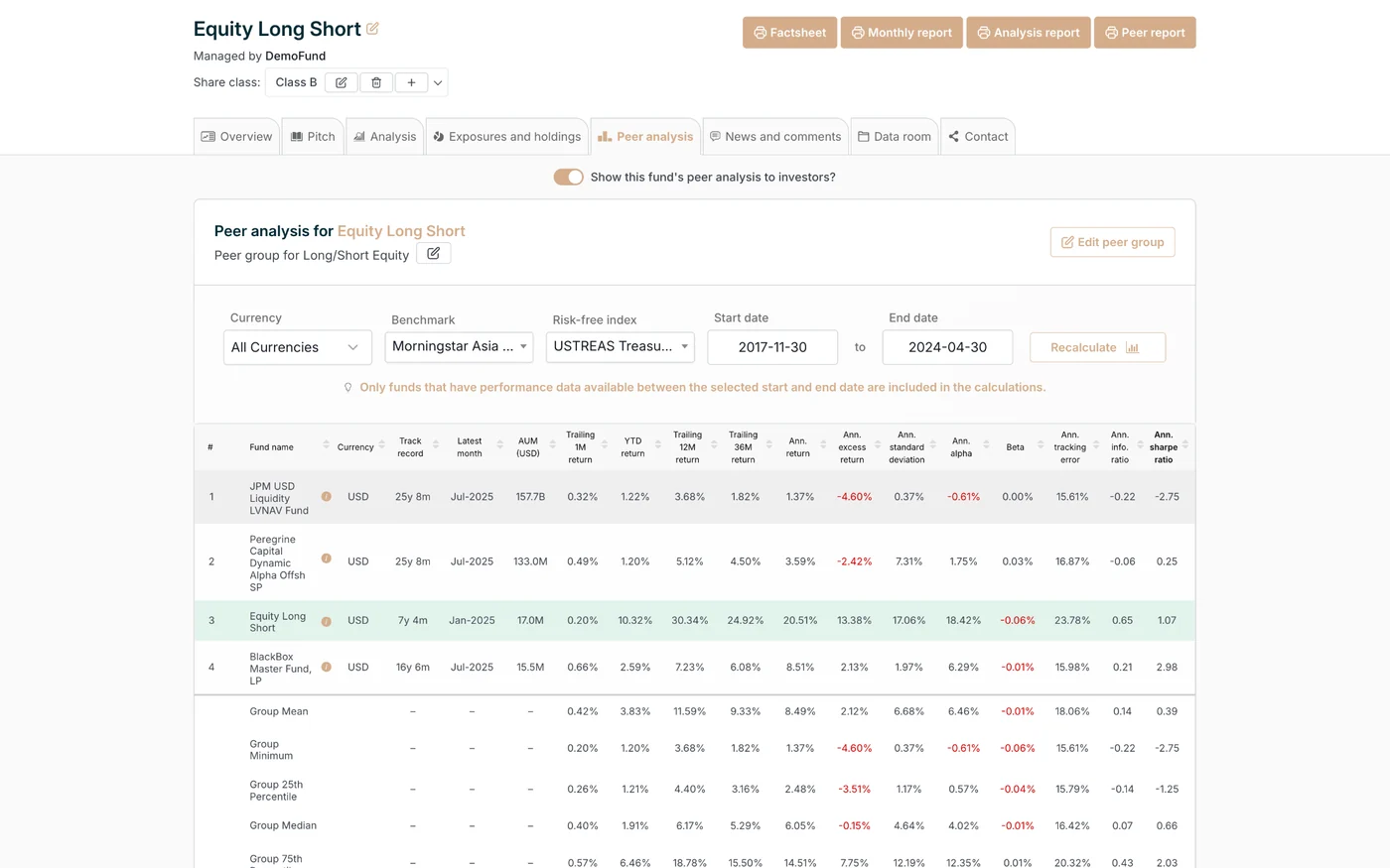
The Peer analysis tab: a dense comparison table against the peer group.
News and comments
The News and comments tab: a blog-style feed of fund updates.
Data room
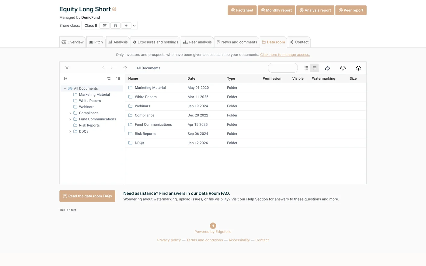
The Data room tab: a folder tree and file table of fund documents.
Contact
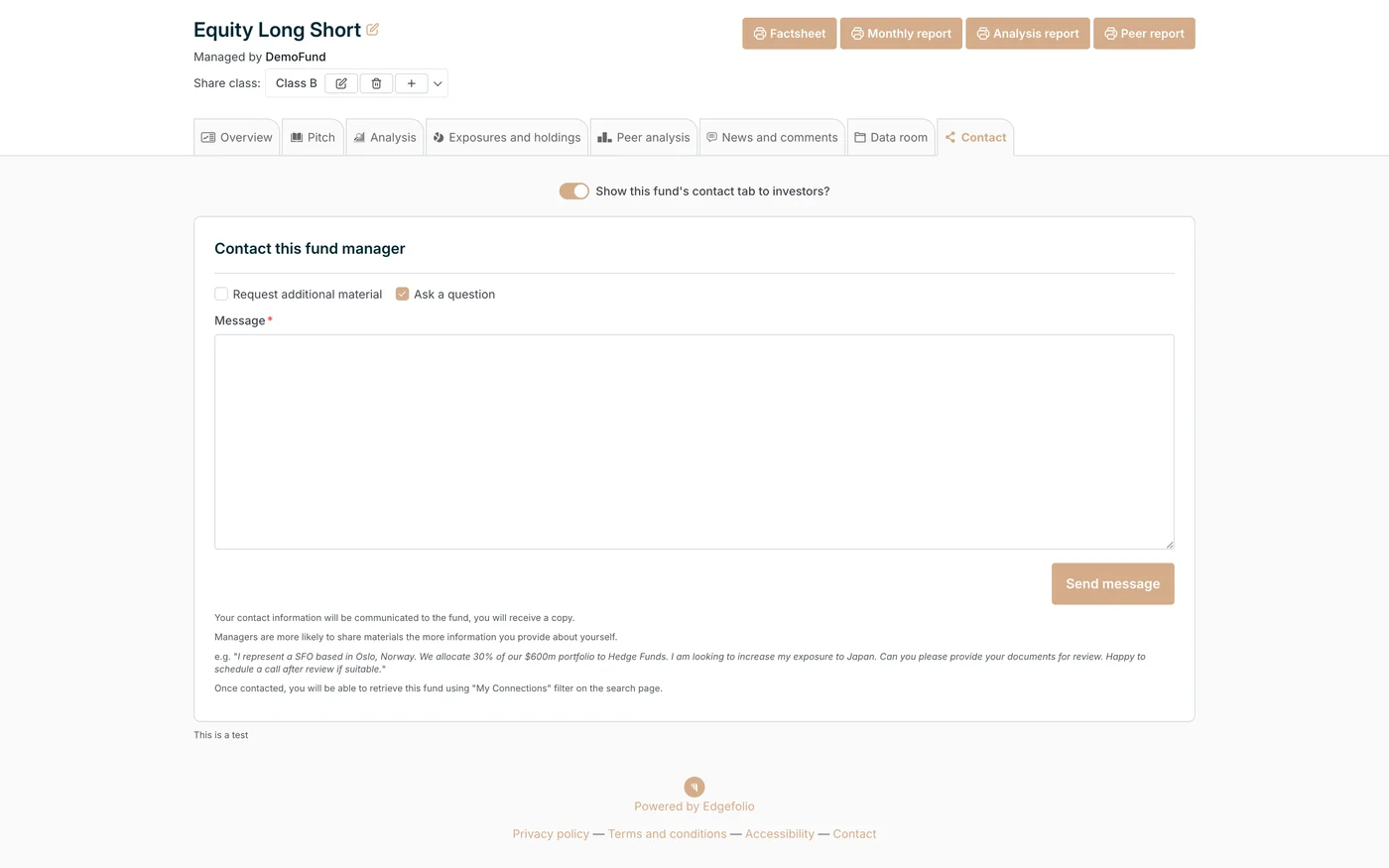
The Contact tab: a message form to reach the fund manager.
The eight tabs of the original profile. This is what the research worked from.

Allocators are senior and hard to book, so I rebuilt the personas as AI research agents and put my questions to them between sessions. The agents sharpened the questions. Real allocators settled the answers.

Who uses a fund profile A top-of-funnel timeline. A prime broker introduces the fund and the fund manager keeps the profile current. The allocator's analyst screens it, the investor builds the case in the data room, and an IC memo goes to the committee for a yes or no. This case study covers both sides, the highlighted stages: the fund manager who builds and maintains the profile, and the analyst and data room on the investor's side. The fund profile The decision Prime broker Fund manager Analyst Data room Committee introduces the fund builds & keeps current discovers & screens DDQ, ODD, the IC memo decides, yes or no

Midway, the moderated sessions stopped giving me new answers. Nobody was asking for more. I went looking anyway. The sales team and the customer success manager hear allocators every day, so I went to them for the unprompted kind: the complaint log, the daily pain points, raw data no test session could give me. That is where the real issue showed itself. Two people were reading one profile with opposite jobs. The analyst screens funds out. The portfolio manager builds the case for the investment committee. One profile was doing both jobs, and neither well.

Usability testing with allocators validated a split information architecture

I reframed the work around jobs to be done and UX psychology. Each reader's job set the order of the page, and Tesler's law, cognitive load and information scent set its shape. Then I built two structures to test it. One full page holding everything, in order. One profile split in two, the Conviction Funnel to catch interest and the Investor Hub to hold the proof. Allocators backed the split. Each page now starts where its job starts.

The Conviction Funnel follows the analyst's five screening questions

The analyst came first. In the recordings they opened a tab, found nothing that answered their question, and left. I mapped the order a screener asks their questions and made that order the page. Five questions, each section earning the next, capped at five because that was as far as testers followed.

Tesler's law moved the complexity into the structure. Cognitive load set the cap at five. Information scent means every heading promises its answer.

  1. 01Hook

    What does this manager believe, and why should I keep reading?

    The strategy and the manager's reasoning, before any number.

    In the profile
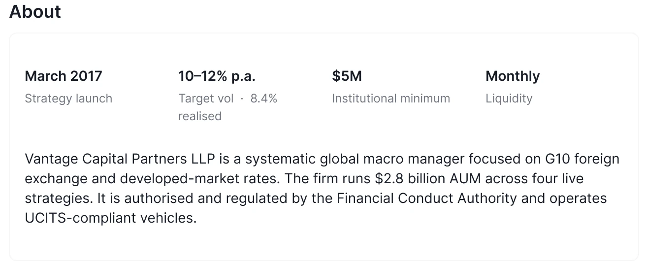
    The About row of the fund profile: strategy launch March 2017, target volatility 10–12% with 8.4% realised, a $5M institutional minimum, monthly liquidity, and the firm in two sentences
  2. 02Proof

    Does the record back the story?

    Returns, key metrics, the audited track record.

    In the profile
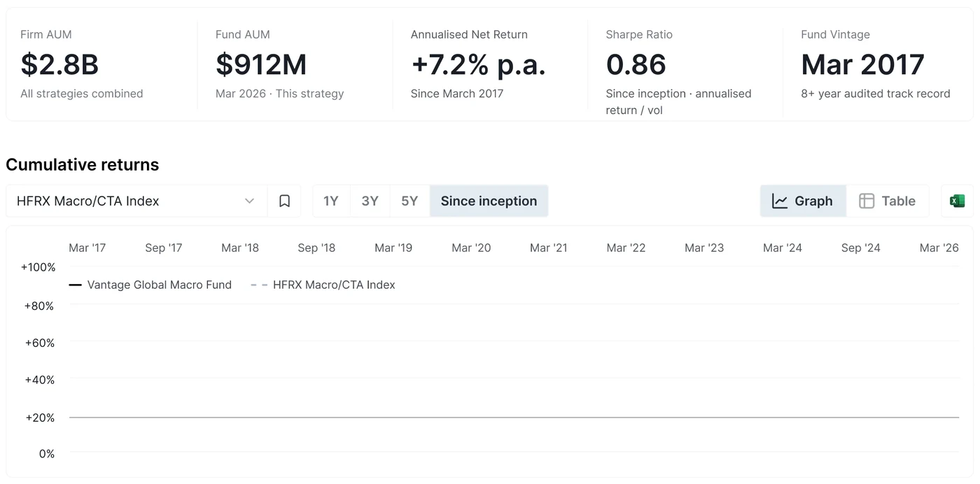
    The fund profile's headline figures and cumulative returns since inception against the HFRX Macro/CTA Index
  3. 03Risk

    What could go wrong, and do they manage it?

    Drawdown, volatility, exposures, how the fund behaves under stress.

    In the Investor Hub
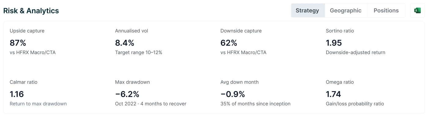
    The Investor Hub's Risk and Analytics: upside and downside capture, annualised volatility, Sortino, Calmar and Omega ratios, max drawdown and average down month
  4. 04Trust

    Who are these people, and does the operation hold?

    Team, structure, service providers, the compliance posture.

    In the profile
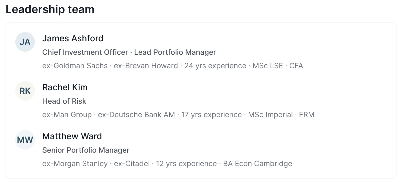
    The fund profile's leadership team with their track records: the Chief Investment Officer, the Head of Risk and a Senior Portfolio Manager
  5. 05Access

    How do I invest, and on what terms?

    Liquidity, minimums, the data room and the path to allocation.

    In the profile
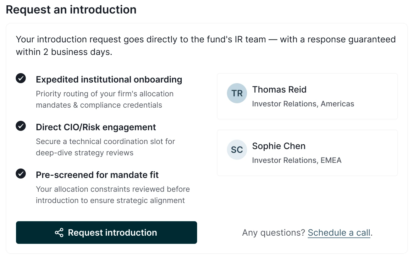
    The fund profile's introduction request: what the allocator gets, the investor relations contacts, and the Request introduction button

I built the prototypes with AI tools and tested them. Allocators went looking for the data on their own. The order did the persuading.
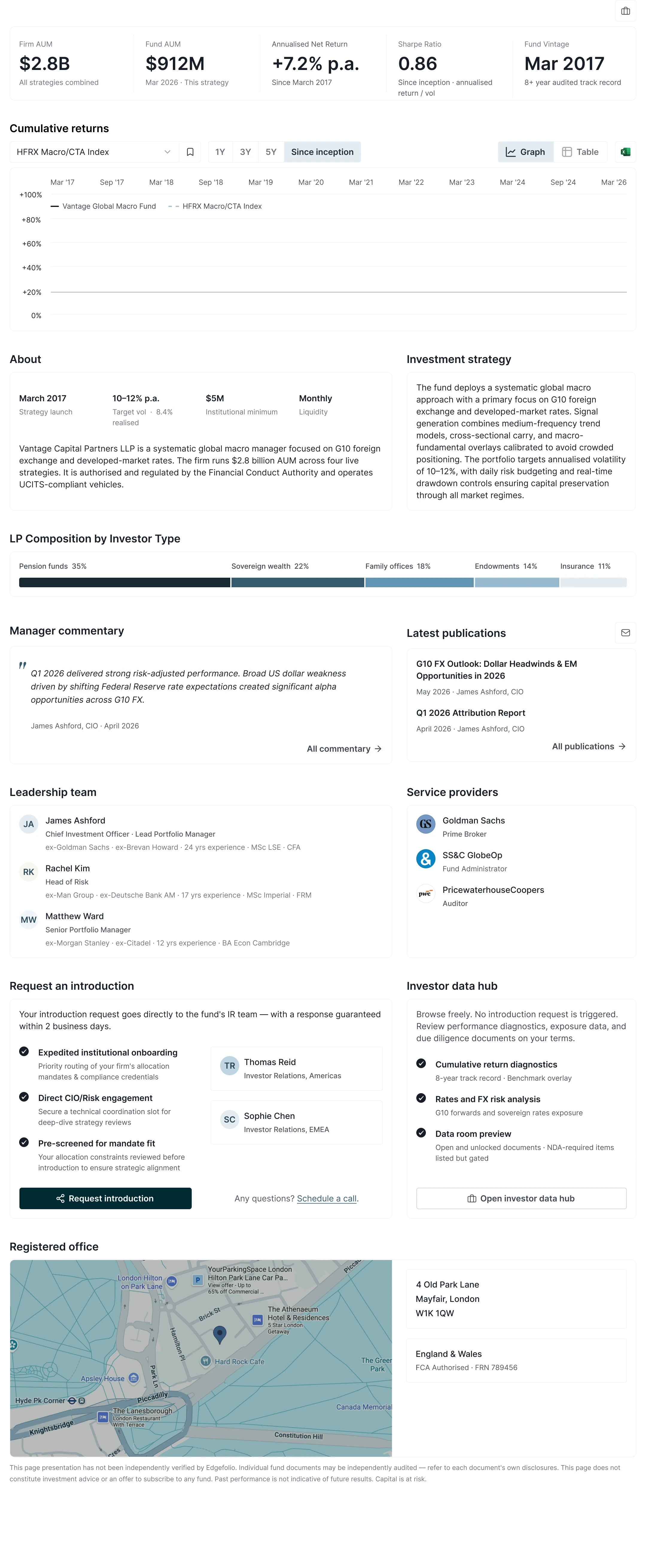
The whole Conviction Funnel fund profile: headline figures, cumulative returns, About and investment strategy, LP composition, manager commentary and publications, leadership team and service providers, the introduction request and investor data hub, and the registered office
The fund profile. Scroll inside it, the nav and fund title stay put
"I don't trust a number I can't see the reasoning for."
What an allocator told me in a research session I ran. It became the rule the whole rebuild followed.
Before · eight tabs, no order
  • Overview
  • Pitch
  • Analysis
  • Exposures
  • Peer analysis
  • News
  • Data room
  • Contact
1Conviction Funnel

The screener · invites you in

  • Hook, proof, risk, trust, access

from Overview · Pitch · Analysis · Contact, re-sequenced

2Investor Hub

The proof · when you're ready

  • Analytics, peers, data room, gated docs

from Exposures · Peer · News · Data room

The new architecture, one page per reader. Solid lines build the decision, hollow lines hold the detail.

The Investor Hub carries the due-diligence evidence to investment committee

Once the analyst is convinced, the portfolio manager takes over and the job turns to proof. The Investor Hub holds it: a data room requested and granted so compliance can sign off, and a memo tool that drafts the committee memo.
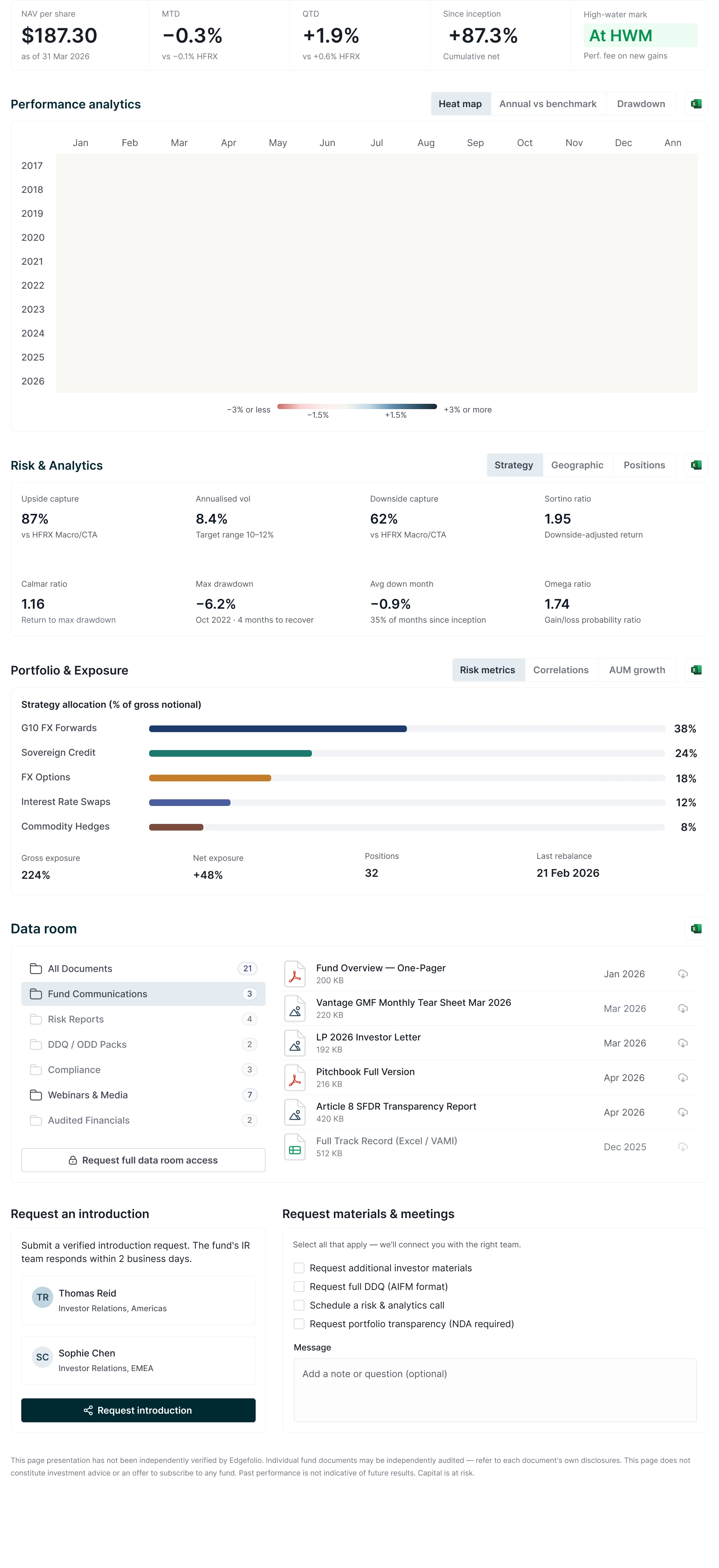
The Investor Hub: headline figures, the monthly returns heat map, risk and analytics, strategy allocation, the data room with gated folders, and introduction and materials requests
The Investor Hub, what the portfolio manager takes into committee. Scroll inside it
The old Analysis tab's monthly returns: a bar chart of every month from November 2017, each month labelled on the diagonal along the foot The Investor Hub's monthly returns heat map: Performance analytics, with every month from 2017 to 2026 and an annual column on the right, shaded from red below minus three per cent to navy above plus three
The monthly record, drawn twice. Drag to compare

Fund managers see the funnel in reverse, with automated onboarding

The fund manager watches the same profile from the supply side. Their dashboard is the Conviction Funnel in reverse: who is looking, what they read first, what still needs work.

The manager's Fund dashboard: profile views, data room visitors, allocators in pipeline and introduction requests; the deal pipeline; live allocator activity with what each allocator read and for how long; introduction requests to approve; and profile health
The manager's Fund dashboard. The live session shows the commentary being read before the numbers.

Getting a fund listed was manual and piecemeal. I rebuilt it as an automated journey for the capital-introduction teams, from the first invite to self-serve learning.

How a profile earns an investor's trust is an essay of its own: Who uses a fund profile?

The manager onboarding journey One rail with three stops. Reach, an email sequence: a triggered invite from the capital-introduction team, staged reminders, no manual chasing. Activate, the in-app onboarding flow: credentials, signed documents, fund selection, identity, then the guided profile build with benchmark and holdings set up in place. Retain, the learning hub, which teaches the product as the manager goes, self-serve, so the team scales without headcount. Reach Activate Retain Email sequence In-app onboarding flow Learning hub Triggered invite from the capital-introductionteam, staged reminders, no manual chasing. Credentials, signed documents, fund selection,identity, then the guided profile build, benchmarkand holdings set up in place. Teaches the product as the manager goes, self-serve,so the team scales without headcount.

7 of 7 allocators reached the data tier unaided, and 420+ managers onboarded

In testing, 7 of 7 allocators reached the data tier on their own. The onboarding brought 420+ managers in at Bank of America in three months. Institutional allocation runs on months to years, so the 20% conversion lift is an honest projection. The prototypes came out of the AI framework I proposed in January.

I reframed a layout brief as a structural product decision

I was handed a layout job and found a structural problem nobody had named. The brief said redesign the profile. The evidence said two jobs, each needing its own surface, and it took going past the research plan to see it. The sharpest input came from the people in allocator conversations every day. On a project shaped like this one, that is where I now start.

Scope
  • Fund profile, onboarding and Investor Hub, end to end
  • Information architecture and navigation
  • Systems thinking: one architecture across all three
  • Building a design system and setting patterns
Method
  • Discovery: allocator interviews and AI research agents
  • AI prototypes, user tested with allocators
  • UX psychology: complexity moved off the reader
  • Adoption tracked with analytics through onboarding